I believe in love at the first sight.
Well, not love as in romantic relationship, but audiences' love for you when you're about to present something. Or we usually called it First Impression.
I believe First Impression is so important.
Have you ever heard the term dress to impress? You put on you best suit to attract other people visually. So you would please their eyes by having a very high face validity -- regardless the fact that you might only be blabbering non-sense.
I worship face validity so much, becauseI always talk non-sense that is the first way to engage audiences. One of my way to get my audiences is by creating awesome visual experience,
YES I AM TALKING ABOUT MAKING GOOD PPT SLIDES!
I mean, seriously people, it's 2016 and why the hell are you still making PPTs like you just carved something out of the rocks? Using powerpoint is not that hard! You just need to learn the basic and then, voila, you can design almost everythingggg!
Lucky you, I am sodenying that I have thesis defense responsibility nice that I would give tips & trick to create so simple yet impressive slides.
If you use Office 2013, then you can use the magic tool called eyedropper.
3. LAYOUT
BONUS TIPS!
Well, not love as in romantic relationship, but audiences' love for you when you're about to present something. Or we usually called it First Impression.
I believe First Impression is so important.
Have you ever heard the term dress to impress? You put on you best suit to attract other people visually. So you would please their eyes by having a very high face validity -- regardless the fact that you might only be blabbering non-sense.
I worship face validity so much, because
YES I AM TALKING ABOUT MAKING GOOD PPT SLIDES!
I mean, seriously people, it's 2016 and why the hell are you still making PPTs like you just carved something out of the rocks? Using powerpoint is not that hard! You just need to learn the basic and then, voila, you can design almost everythingggg!
Lucky you, I am so
THREE SECRETS ON CREATING IMPRESSIVE YET SO SIMPLE SLIDES
When we talk about impressive slides, we only talk about:
FONT | COLOR | LAYOUT
(yes, I didn't ask for more but this three!)
1. FONT
For God's sake, STOP USING TIMES NEW ROMAN! This is SLIDES, not THESIS!
Moreover, here's a pic of the most hated fonts in the world. Just. Don't. Use. Them. Please.
 |
| One designer dies, if you keep using this font in your slide. |
There are a lot of sites providing awesome fonts. My favorite is dafont.com or simply just google, guys.
WHAT?! You find it so tiring to download new fonts?
Okay, then it is super okay to use default font.
A tip to remember: DON'T USE MORE THAN 2 TYPES OF FONTS!
If you already choose font like THIS FOR HEADER, then use THIS FOR THE CONTENT.
Get the difference? Header menggunakan font yang ada kaitnya, sementara content tidak ada kaitnya. Atau dalam bahasa anak desain, disebut 'serif' (thanks infonya Nana & Erfath!).
.
 |
| I personally love to use Rockwell for header and Century Gothic for content |
2. COLOR
In this beautiful world, every color has its own color compatibility, and they are all gather in a thing called palette. Unless you are the truest artist, for God sake, don't ever try to create your own color palette. It is just not wise. Kindly google for a color palette.
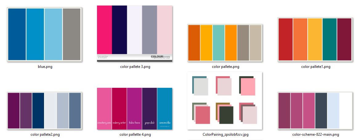 |
| Collection of my favorite color palettes. I'm so wise, I never cross the line, only one palette for one whole PPT. |
 |
| Simply click the desired color in color palette, then voila, you're now 22% more awesome! Anw, see how I don't use any color other than the one in the umbrella? |
3. LAYOUT
Well, simple layout is the best. I prefer white background because it is just fit in every kind of room.
But only white is boring. To make it less boring, I put a frame to my slides like this:
 |
| See how I only use shapes? |
BONUS TIPS!
Don't ever try to use clipart/images with watermarks/blurry images.
The safest way to make your picture color palette friendly is by turning it into black and white.
 |
| See how I consistently use the font, color, and layout? |
I hope these tips helps!
Good luck on making the very best first impression!
#UntukPPTYangLebihBaik #VivaLaFaceValidity
p.s. you can check for more references on my super awesome collection of PPTs or expert guidance from slideshare
This comment has been removed by the author.
ReplyDeletemayan nambah ilmu hehe, thx kak
ReplyDeleteHappy to help! Thanks for reading yaa :)
DeleteFirst impressions are incredibly significant and can be greatly influenced through our appearance.
ReplyDelete